Thousands of people already follow your brand on Instagram or TikTok. They know your products, they trust you, and yet most of them have never taken your diagnostic — usually because they have no idea it exists.
Instagram and TikTok have one peculiarity: outbound links are rare and constrained. No clickable link in a post, a single slot in the bio, stickers in stories. That constraint shapes everything: each format has its own mechanic for moving someone from the content to the diagnostic, and it's that mechanic, more than the content, that determines how many starts you get.
Promoting a diagnostic organically on Instagram and TikTok is therefore less about content than about the format you choose. Here are the eight that work, from the simplest (one line in the bio) to the most demanding (going live). For each one: what determines whether it works, the brands using it well, and the mistakes that make it fail.
1.The link in bio, the only permanently clickable link
The bio is the only place on Instagram and TikTok where a link is permanently clickable. It's the social equivalent of your site's navigation menu: permanent exposure, almost no effort, no risk. And yet most brands put a generic link to their homepage there.
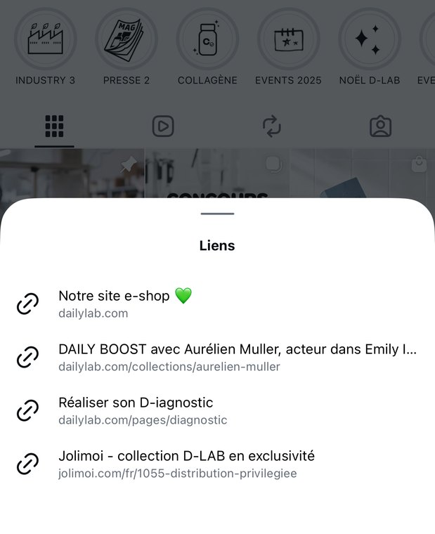
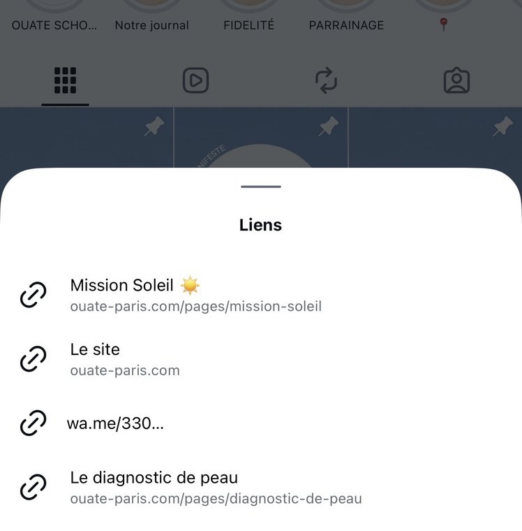
The brands whose diagnostic sits at the heart of the buying journey worked this out long ago: at Laboté, where every bespoke product starts with a diagnostic, or at D-Lab Nutricosmetics, the bio and the link-in-bio don't point to a catalog but to the entrance of the journey — the diagnostic.
Two decisions to make: the call-to-action text in the bio, and where the link goes.
The call-to-action text
The bio line that precedes the link plays the same role as a menu label on your site: it drives the click-through rate. The diagnostic shouldn't be one line among others: it's the conclusion of the bio and the main action offered to the visitor.
- Lines 1-2The brand's positioning.
- Line 3A proof point or a piece of reassurance: a rating, a number of customers.
- Line 4The call to the diagnostic and the arrow down to the link: “👇 Find your routine in 2 min, free diagnostic”.
Where it goes: direct link or link-in-bio page
| Destination | When to choose it | Limitation |
|---|---|---|
| Direct link to the diagnostic | The diagnostic is THE priority lever right now (launch, campaign) | Sacrifices every other destination (new arrivals, blog) |
| Link-in-bio page (Linktree, Shopify Linkpop, your own page) | Several destinations to maintain in parallel | The diagnostic has to be the first button, or it gets diluted |
2.The story highlight, your diagnostic permanently on display
Story highlights are the only permanent stories: they sit below the bio, on every profile visit, with no time limit. A highlight dedicated to the diagnostic turns 24 hours of ephemeral content into a permanent conversion asset, positioned exactly where new visitors size up the brand.
- Story 1The promise: “Your ideal routine in 2 minutes”.
- Story 2A screen recording of the diagnostic in progress, two or three questions scrolling past.
- Story 3The results page and the recommended routine.
- Story 4A testimonial or a customer result.
- Story 5The “Take my diagnostic” link sticker, full screen.
Another approach: teach the method
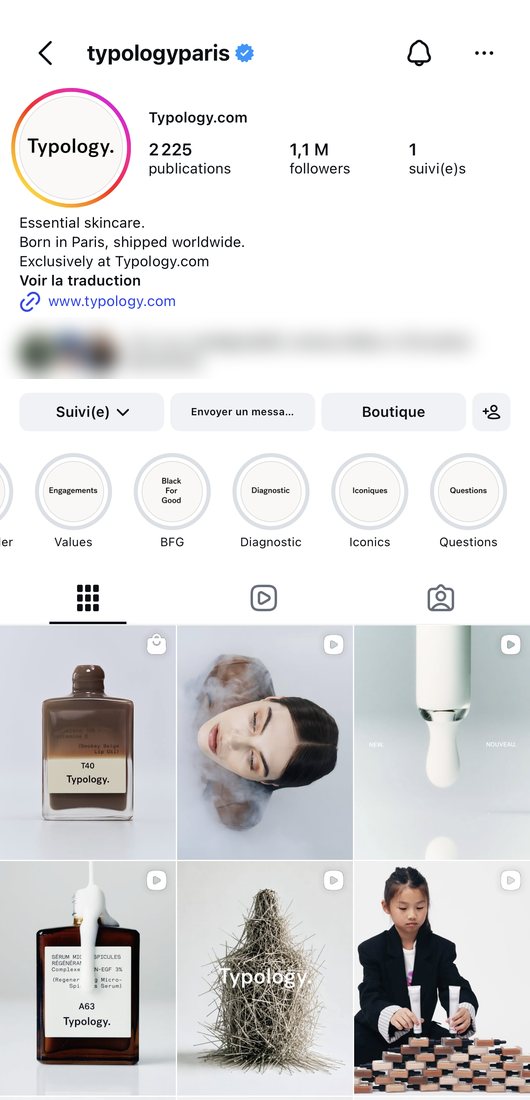
Typology takes the opposite tack: explain rather than sell. Its last screens are given over to a substantive question — why 24 skin typologies — which answers the most common doubt people have about an online diagnostic: what is the result actually based on?

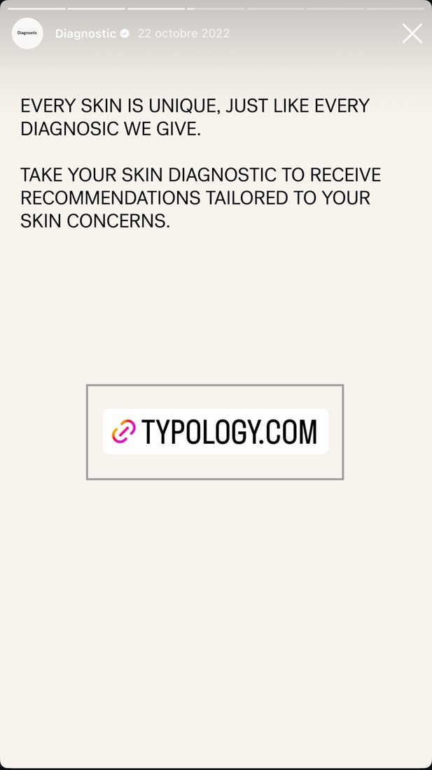
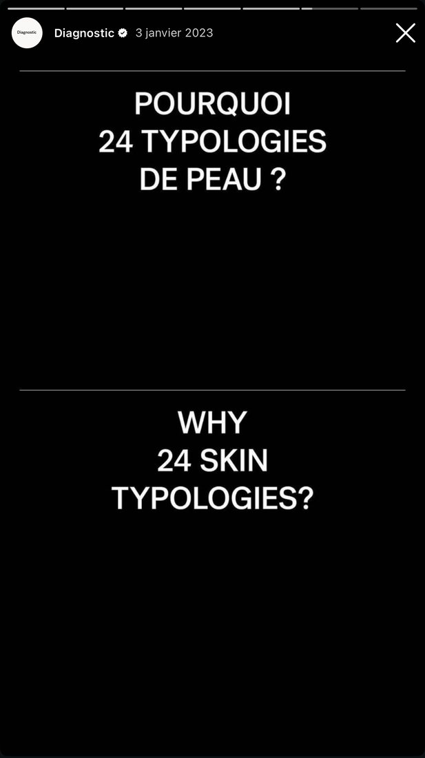
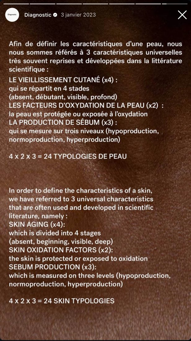
Two adjustments that would get even more out of this sequence
The link sticker leads to the homepage: pointing it straight at the diagnostic saves the already-convinced visitor from having to hunt for it.
The last screen explains the 24 typologies in one dense block of copy. The same content split across two or three screens reads at story speed, and teaching is precisely what this sequence does best.
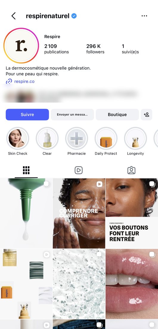
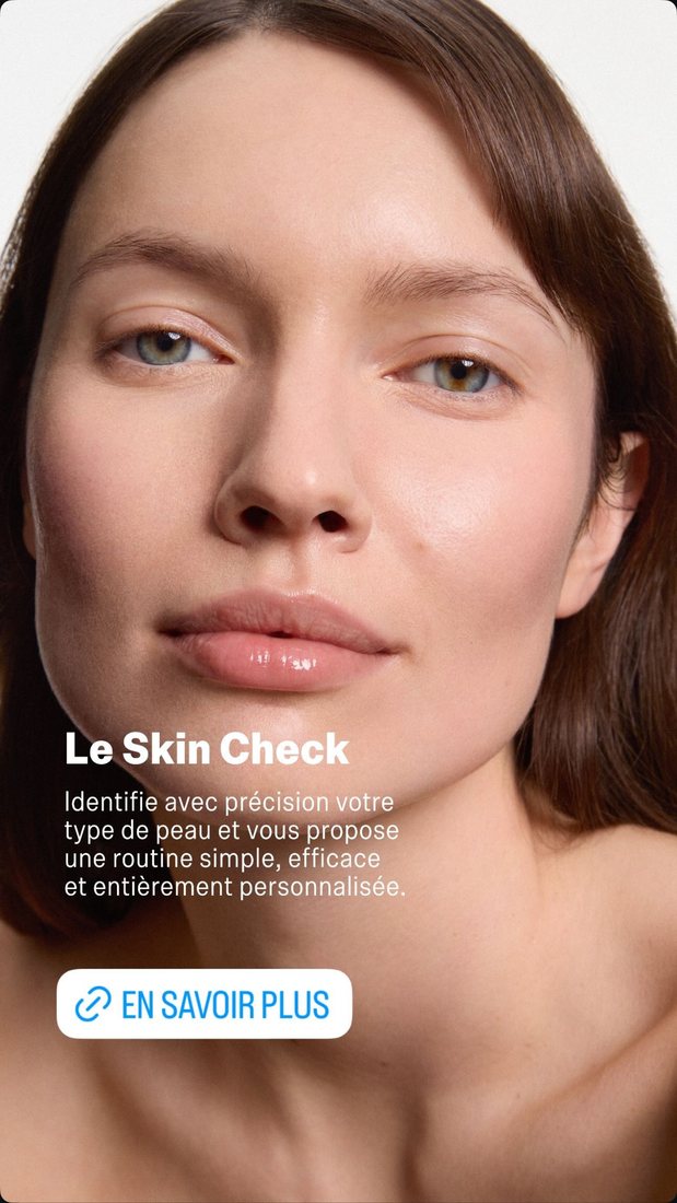
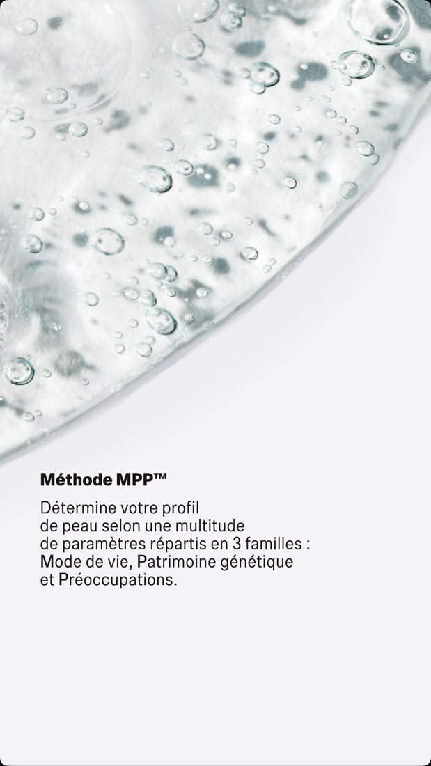
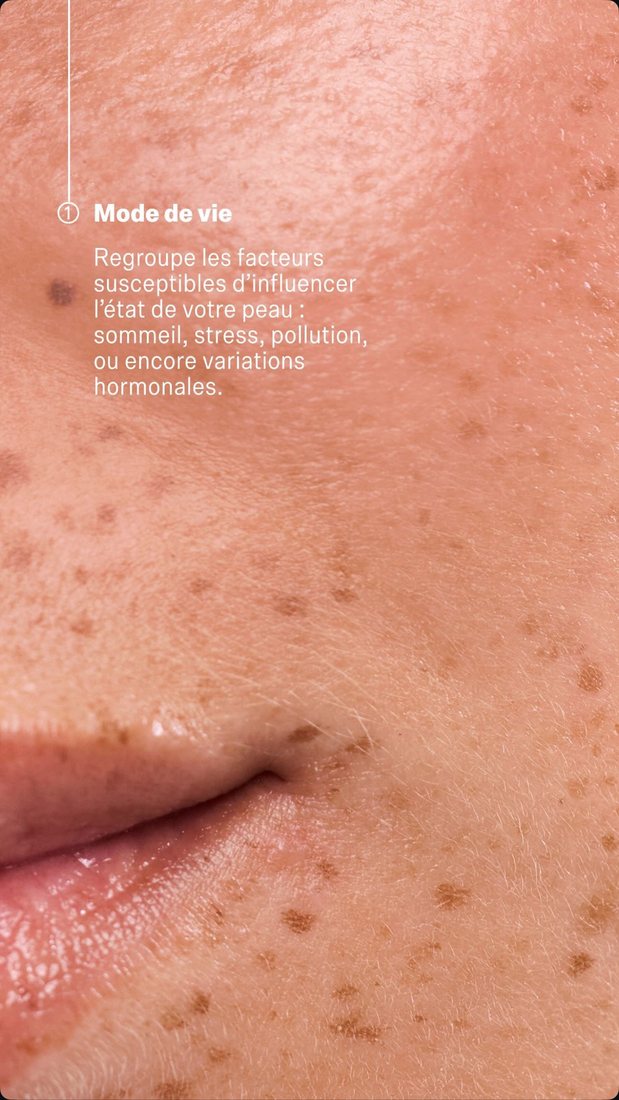
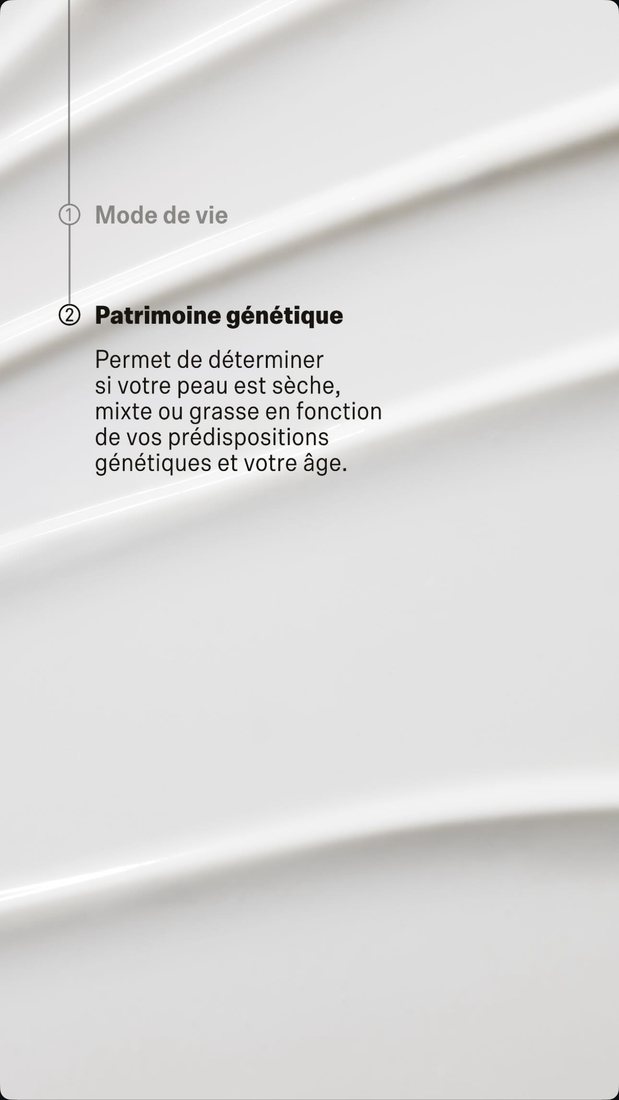
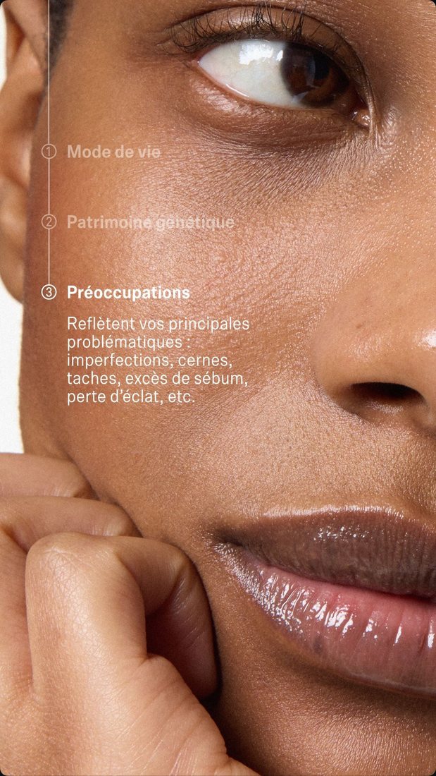
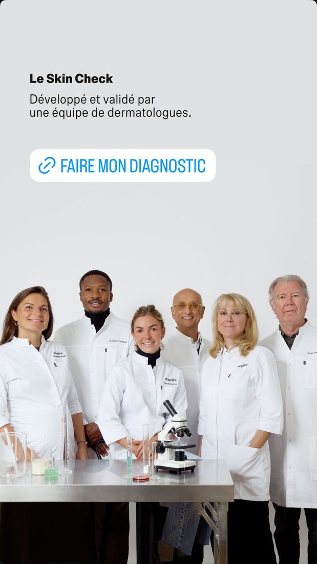
Drag the strip, and click an image to see it full size.
What Respire does that departs from the recommendation
Respire doesn't repeat the link sticker on every screen: it's on the first and the last, with the four in the middle used purely to explain the method.
And the last screen doesn't show a results page, but the six dermatologists who validated the diagnostic. For a brand whose argument is scientific backing, that's coherent: what the person needs to believe before clicking isn't “I'm going to get a routine”, it's “this diagnostic is serious”. It's on you to decide based on what actually makes your customers hesitate.
3.The post that simply features the diagnostic
Before any mechanics, there's the post that just says what it has to say: your diagnostic exists, here's what it does, here's how to start it. It's the most obvious format and, for that very reason, the one most often botched: one launch post, then nothing for six months.
The format has one constraint and one privilege. The constraint: no clickable link, so the post never converts on its own; it sets up the click that the bio or the keyword will go and collect. The privilege: Instagram lets youpin three posts to the top of your profile. A pinned post stops being today's content and becomes the first thing a new visitor sees.
- The visualThe diagnostic itself: a question on screen, or the results page. Not a product photo, which says nothing about anything happening beyond a sale.
- The first wordWhat the person gets out of it, not what the tool is. “Your routine in 2 minutes” rather than “Discover our new diagnostic”.
- The durationHow long it takes, said explicitly. It's the number-one hesitation, and three words clear it.
- The handoffWhere to go, since the link isn't clickable: “link in bio”, or a keyword to comment.
That leaves frequency. One launch post a year isn't enough: put the diagnostic back in front of people at every genuine occasion — a new product, a change of season, a question that keeps coming up. The subject is never the diagnostic itself, it's the reason to take it now.
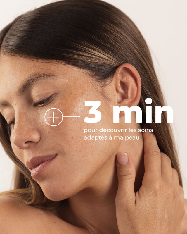
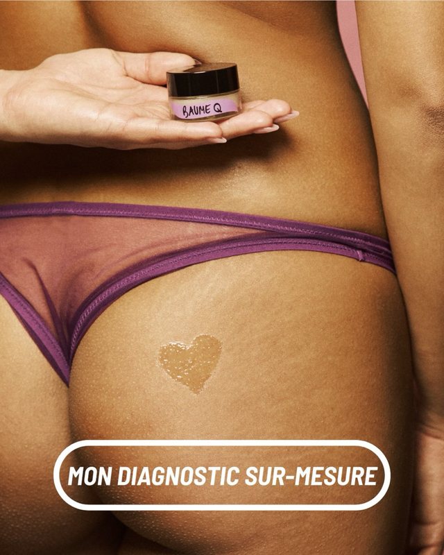
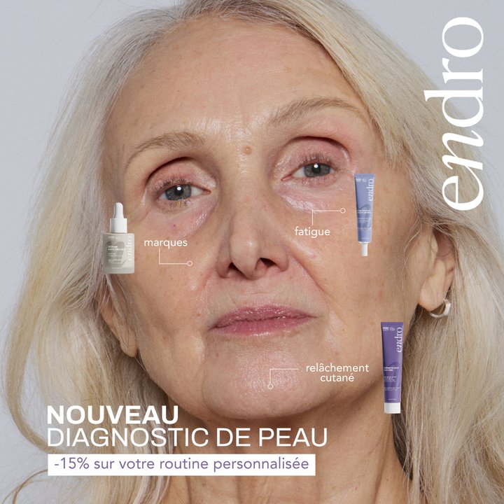
None of the three talks about the tool: they talk about duration, outcome or concerns. Endro goes furthest by annotating on the face what the diagnostic detects, and adding a concrete quid pro quo. That leaves the link: organically, a “Take the diagnostic” written on the visual isn't one. Baûbo catches that in the caption, spelling out the path in full, baûbo.fr / menu / diagnostic.
4.Posts with quiz mechanics, a taste of the diagnostic
Interactive stickers (polls, quizzes, sliders, questions) are the native mechanic of stories. Used on their own, they generate engagement without conversion. Used as a taste of the diagnostic, they become a funnel: the person answers 2 or 3 questions in the story, self-identifies as concerned, and is then offered the full diagnostic to get “their real answer”.
Two answers, no effort. The person places themselves without thinking about it, and the poll lifts the story's reach.
The right answer shows immediately. That's where the educational value sits, and it's instant.
You offer the next step at the exact moment the question is still open: what it means for her skin specifically.
The “which one should I choose?” carousel
The same mechanic exists in a post, and it has the advantage of lasting: where a story disappears in 24 hours, a carousel stays on the profile. The principle is identical: pose a question of choice, scroll through the options, let the person recognize themselves in one of them. Only the conclusion changes, for want of a clickable link; the handoff goes through the bio or a keyword.
IN HAIRCARE, in 6 slides
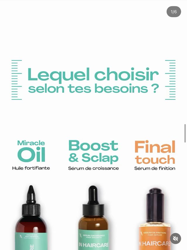
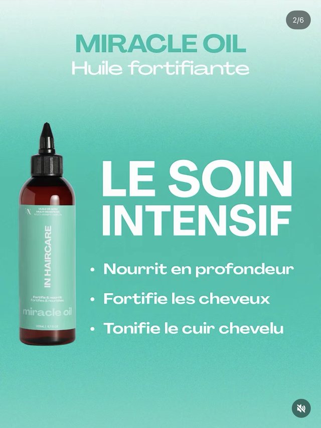
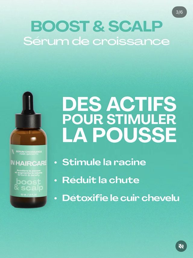

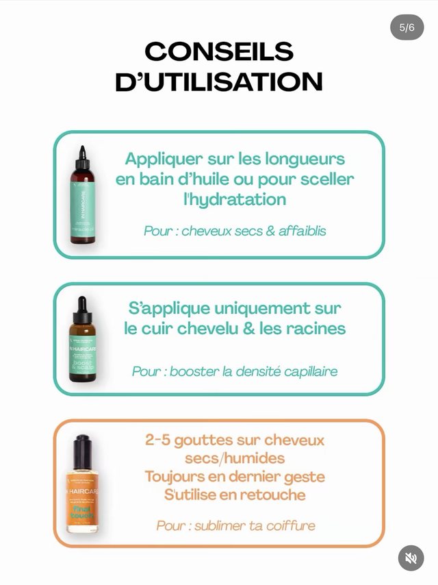
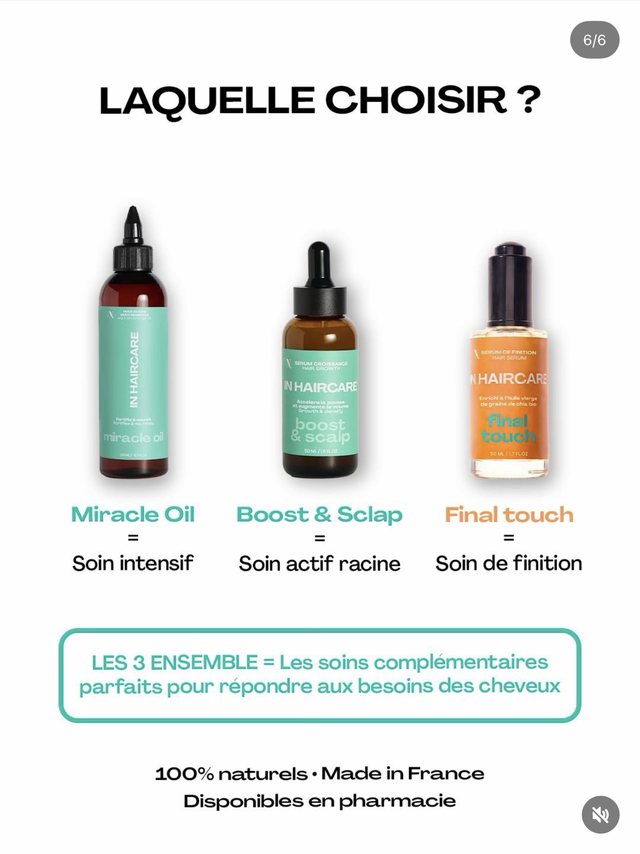
Les Secrets de Loly, in 5 slides

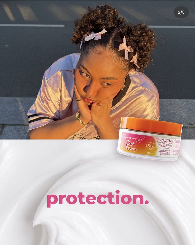
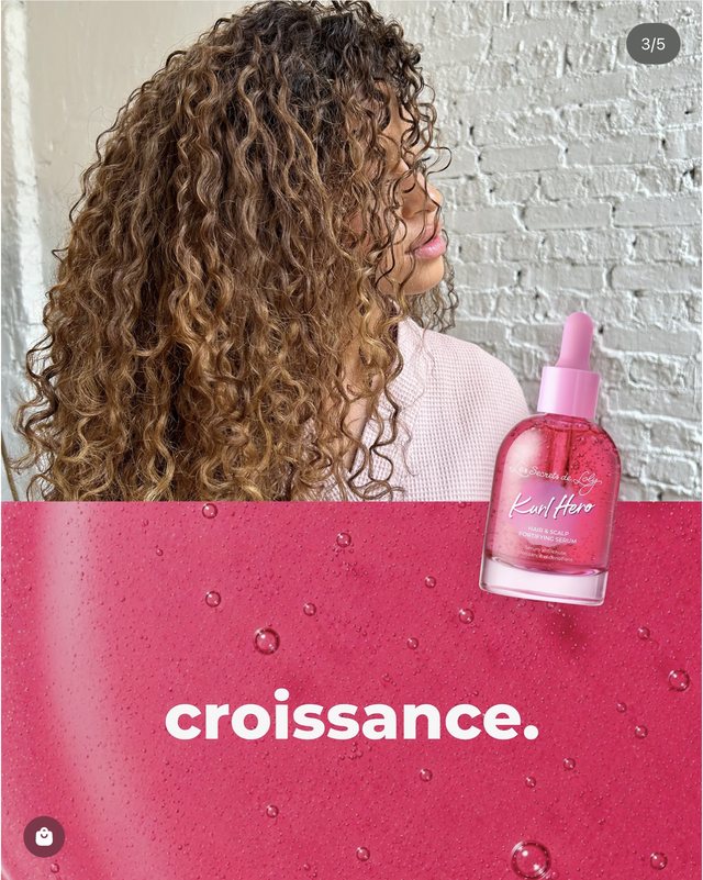
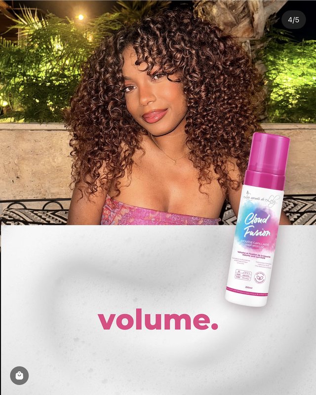
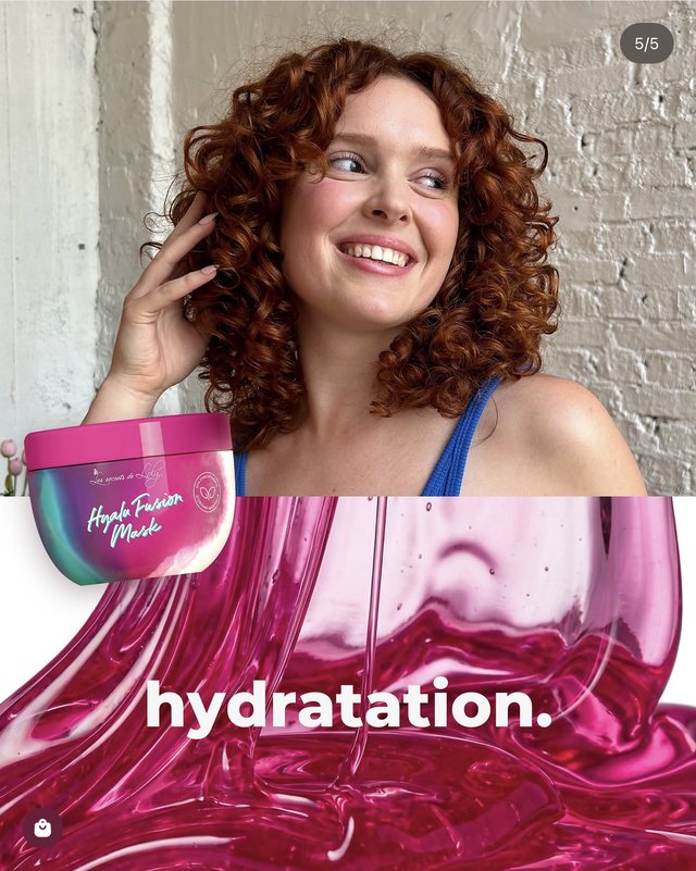
Both posts do the diagnostic's job, in a much cruder way: they reduce the catalog to a handful of needs and ask the person to place themselves. Anyone torn between repair and hydration has just discovered they can't decide on their own. The sentence they're missing fits on one line: “Still hesitating? The diagnostic decides for you.”
5.DM automation: “comment ROUTINE” to get the link
This is the mechanic that has changed organic conversion on Instagram the most in recent years. The principle: the post or Reel invites people to comment a keyword (“Comment ROUTINE”), and an automation tool (ManyChat being the most widespread) automatically sends the diagnostic link by direct message to every commenter.
The format solves Instagram's two structural problems in a single move: the non-clickable link in posts (the link arrives by DM) and reach (every comment pushes the post through the algorithm). It's the only format on this list where the conversion mechanic improves the content's distribution instead of penalizing it.
- The contentGenuine educational value: “3 signs your routine isn't right for you”.
- The pivot“To find out what suits YOUR skin…”
- The call“Comment ROUTINE and I'll send you the diagnostic by message”.
- The messageA short message, the link, a piece of reassurance: “2 min, free”.
6.The “I'm taking the diagnostic” video, the demo that clears the doubt
The native video format where someone takes the diagnostic on screen and reacts to their results. It's the product demo of the diagnostic: in 30 seconds you understand what it is, how long it takes, and what you get at the end. Three possible embodiments, in order of closeness: the founder, a customer, a creator.
- 0-3 sThe hook: “I'm taking my own brand's skin diagnostic — let's see if it knows me”.
- 3-15 sA sped-up screen recording of the questions, with one or two reactions to camera.
- 15-25 sThe results page, the recommended routine read out loud.
- 25-35 sThe reaction: “ok, it picked up something even I wasn't putting into words”.
- 35 s and beyondThe call: “Link in bio”, or “Comment SKIN”.
The best moment in a video like this is when the diagnostic recommends the founder the product she already uses: in one take, the coherence between the engine and the catalog is proven.
Variation: answer a comment like “I don't know which product to choose” with a video, taking the diagnostic live using the details given. Customer service becomes content.
Both creatives come from the Meta ad library, but the format is that of an organic Reel, and they show two different embodiments. Endro follows the script above bar one screen: you see the questions scroll past, you never see the results page. And yet that's the screen the viewer wants to assess. Respire doesn't show the diagnostic at all: it puts an expert on camera and teaches. The missing link is one sentence at the end — “and that's exactly what the diagnostic looks at” — which would turn the lesson into a demo.
7.UGC: when your customers post their own diagnostic
The last format isn't produced, it's orchestrated: it's your customers posting their diagnostic. A reshared story saying “I took [brand]'s diagnostic, here's my routine” is worth more than brand content: it's distributed first to that customer's audience, and it shows recommended products in context. Chosen, personalized, unsponsored: the best possible product advertising.
Diagnostic UGC can't be decreed, it has to be triggered. Three activation points, in order of effectiveness:
| Activation point | Mechanic |
|---|---|
| The results page | A “Share your profile” panel with a generated, ready-to-post visual (the profile, not the sensitive data) |
| The post-diagnostic email | One line in the results email: “Tag us with your routine, we share our favorites” |
| The parcel | A card saying “Show us your routine” with the hashtag and the account to tag |
Same brand, two voices, two ways in: one goes through the approach and the gesture, the other through internal causes. That's precisely what brand content can't produce, because it only has one voice. And that's the tone to aim for: neither one recites a product sheet, each tells you why the subject speaks to her.
Only one thing is missing for these videos to serve the diagnostic, and it costs nothing: that the person shows her result on screen and says what it recommended to her. The recommendation then becomes a demo.
8.Live: the diagnostic talked through in real time by an expert
The Instagram or TikTok live where a brand runs diagnostics in real time: viewers describe their skin in the comments, an expert fills in the diagnostic with them on screen and talks through the results. It's the only format on this list that almost no brand is exploiting yet. And yet all the pieces exist, each validated separately: one-to-one video consultations with an expert (Clarins offers a free “Live Consultation” with a Beauty Coach), beauty live shopping with experts answering questions, and skincare creators' personalized advice lives, which draw thousands of viewers. Nobody has yet assembled the three around a diagnostic. The first brand in your category to do it takes a position that's hard to catch.
The format is worth it above all for what it proves: behind the diagnostic, there's real expertise. It's the natural territory of brands with scientific backing, the ones whose diagnostic is signed by experts. Every case talked through live (“you're ticking tightness and shine in the T-zone, that's the classic profile of dehydrated skin overcompensating, and that's what the diagnostic detects”) teaches the diagnostic better than any banner could. And an hour of live produces a stock of clips: every case handled becomes a “live diagnostic” Reel that feeds the video format from section 6.
The step before going live: the filmed diagnostic
Between the Reel from section 6 and the live, there's an intermediate format, and Endro has already shot it: you sit someone in an armchair, hand them a phone, and film them taking the diagnostic. The brand explains nothing, it observes. The edit alternates between the face and the screen, with the real questions from the diagnostic overlaid.
It's the live, on delay, and it's far simpler to produce: no time slot to announce, no audience to gather, no comments to handle in real time. You keep the essential — someone discovering their result in front of the camera — and you remove everything that makes a live risky. It's the right dry run before going live for real: the same staging, without the safety net taken away.
9.The mistakes that make a diagnostic fail on social
Also worth reading: How do you feature your diagnostic on your beauty e-commerce site?: the 7 on-site placements for maximizing the number of diagnostics started.
Also worth reading: Which email flows should you set up after your e-commerce diagnostic?: converting completed diagnostics into revenue.