A diagnostic is a powerful conversion lever: it guides visitors to the right product, collects first-party data, and creates an experience that feels personalized. But its effectiveness hinges on one thing above all: being seen. Here are all the possible placements for featuring a diagnostic on a beauty e-commerce site, with, for each format, a breakdown of the conditions in which it works, brand examples, and the mistakes to avoid.
1.Navigation menu
The navigation bar is the only area of the site exposed to every visitor, on every page, at every moment of their session. It's the highest-return entry point in terms of setup effort: adding a menu item takes less than an hour and delivers permanent exposure, with no UX risk at all.
The wording of the menu entry is often treated as a detail when it is in fact a strategic decision: it drives both the click-through rate and how the diagnostic is perceived.
Label strategy by positioning
| Label | Positioning | Reference brand | What it communicates |
|---|---|---|---|
| Build My Skincare Routine | Active guidance | The Ordinary | Action verb, concrete outcome, ownership (“my”) |
| Skin Analysis Tool | Scientific / Expert | Byoma | Clinical vocabulary, reassures on how reliable the results are |
| My skin diagnostic | Intimate / Personal | Aime, La Rosée | “My” creates a sense of ownership before the click even happens |
| Diagnostic | Minimal / Direct | Typology, Pomad | Works if the brand already has strong name recognition, too vague otherwise |
| Find my routine | Outcome-driven | Caudalie, Clarins | “Find” implies an unsolved problem, and activates a need |
| Skin quiz | Playful / Mainstream | Sephora, Nocibé | Reads as fast and no-commitment, high click-through rate |
A few examples:




2.Announcement bar
The announcement bar sits above the header: it's the first content visible when someone lands on the site. Very often reserved for commercial promotions (promo codes, free shipping), it's rarely used to feature the diagnostic — which makes it an uncontested space with high potential.
The announcement bar has two distinct effects. A direct one: the visitor clicks and starts a diagnostic. And an indirect one: by reading “personalized diagnostic” before even entering the site, the visitor internalizes that personalization is part of what the brand stands for. That second effect shapes how the whole site is perceived, click or no click.
Effective phrasing vs phrasing to avoid
| ✅ Phrasing that communicates clearly | ❌ Phrasing that's too vague |
|---|---|
| “Find your bespoke routine → 2 min” | “Take our diagnostic” |
| “Not sure which product is right? → Free diagnostic” | “Discover our personalized tool” |
| “[New] Skin analysis, instant results” | “Click here to start” |
| “New season: your perfect routine is waiting →” | “Diagnostic available” |

3.Banner
The banner is the integration with the highest visibility potential. But its effectiveness depends entirely on where it sits in the page. A banner in the hero (the first visible element) has a major impact. That same banner placed below the fold is all but invisible to most mobile visitors.
The key question isn't “should we add a diagnostic banner?” but “how high up the page, and how much of the screen does it take?” A banner that forces product content below the fold can generate more exits than it generates diagnostic starts.
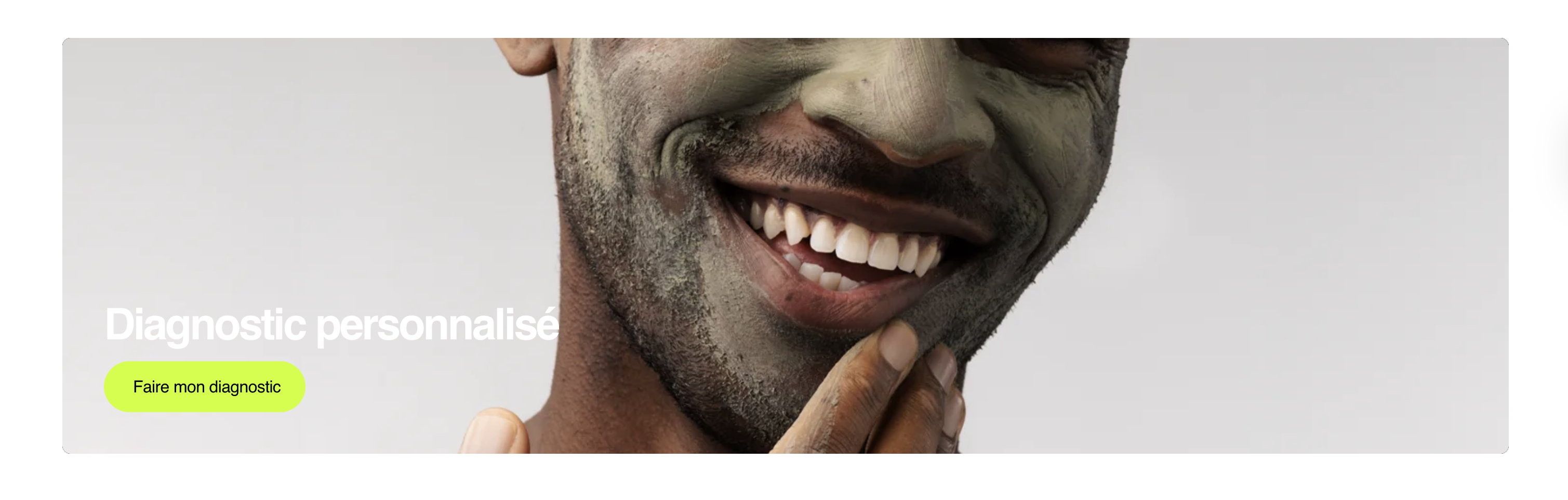
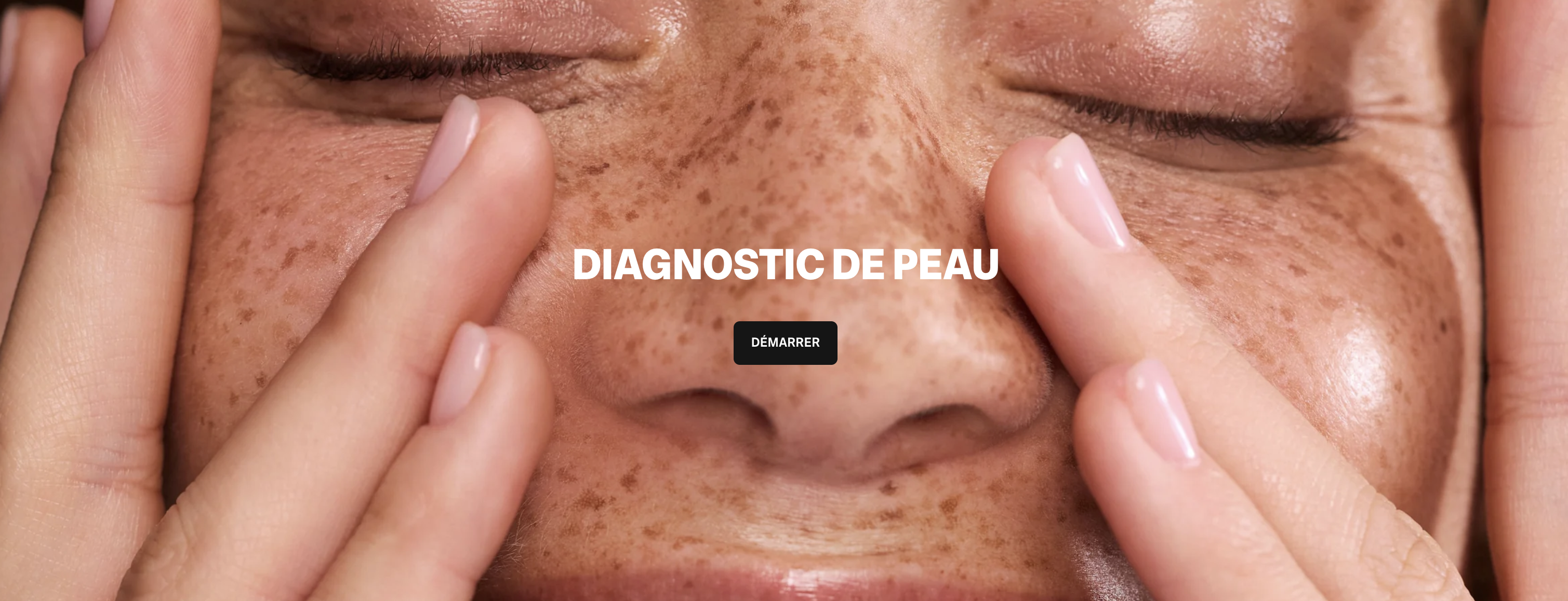
Format A: Simple banner (Pomad, Typology style)
A stripped-back message, a colored background, a single CTA. Consistent with minimalist brand positioning. Very effective on mobile because it doesn't depend on an image that resizes badly.
Headline (max 5 words): “Your bespoke routine”
Subhead (optional, max 10 words): “Free diagnostic · Results in 2 min”
CTA: “Start →”, solid button, contrasting color
Background: brand color or a neutral tone, no photo
Format B: Editorial banner (La Rosée, Caudalie style)
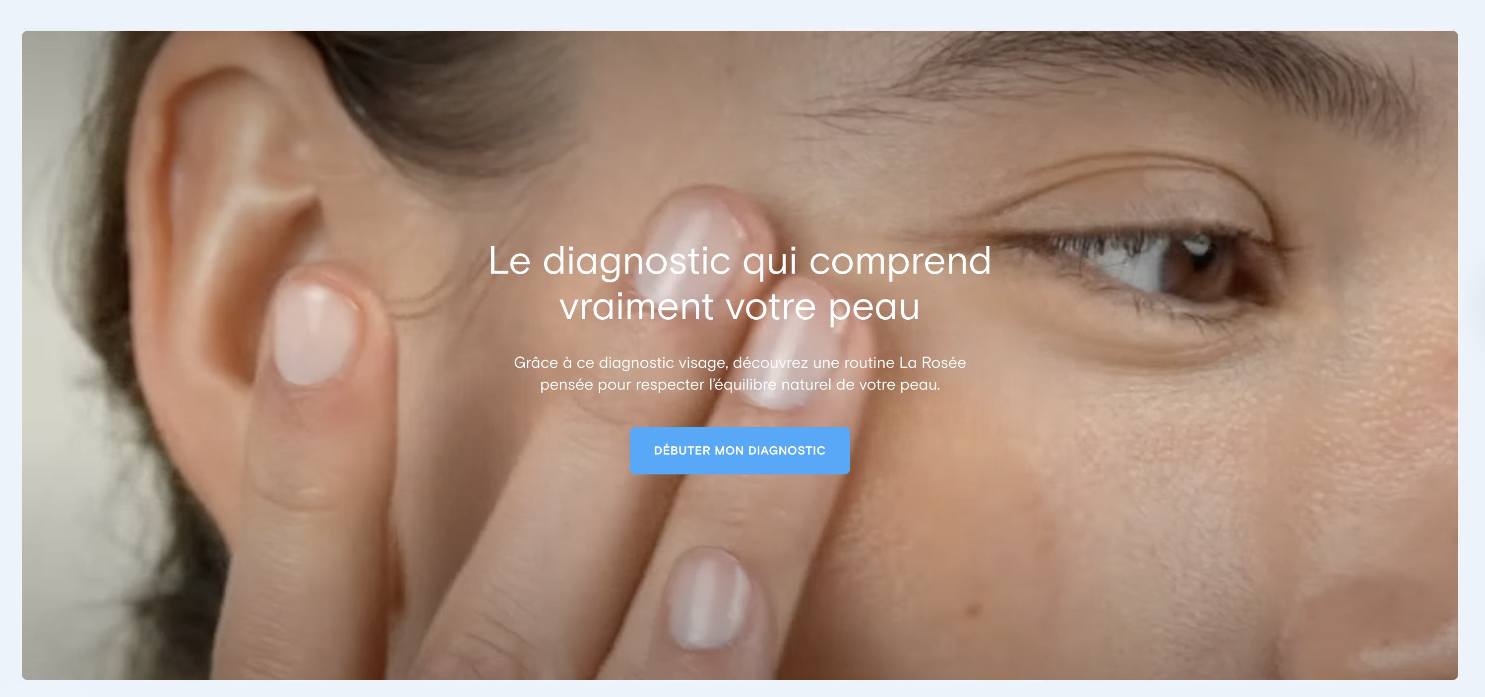
Fuller copy that explains the value of the diagnostic before inviting the click. Relevant when the concept of a personalized diagnostic isn't well known to your audience, or when the brand has an educational stance.
Headline: a question or a promise (“Your skin is unique. So is your routine.”)
Body (2-3 sentences): explain concretely what the diagnostic delivers
Inline reassurance: “Free · No account · 2 minutes”, below the CTA, not above
CTA: “Take my diagnostic”, active verb, ownership (“my”)
Format C: Product-page module (contextual integration)
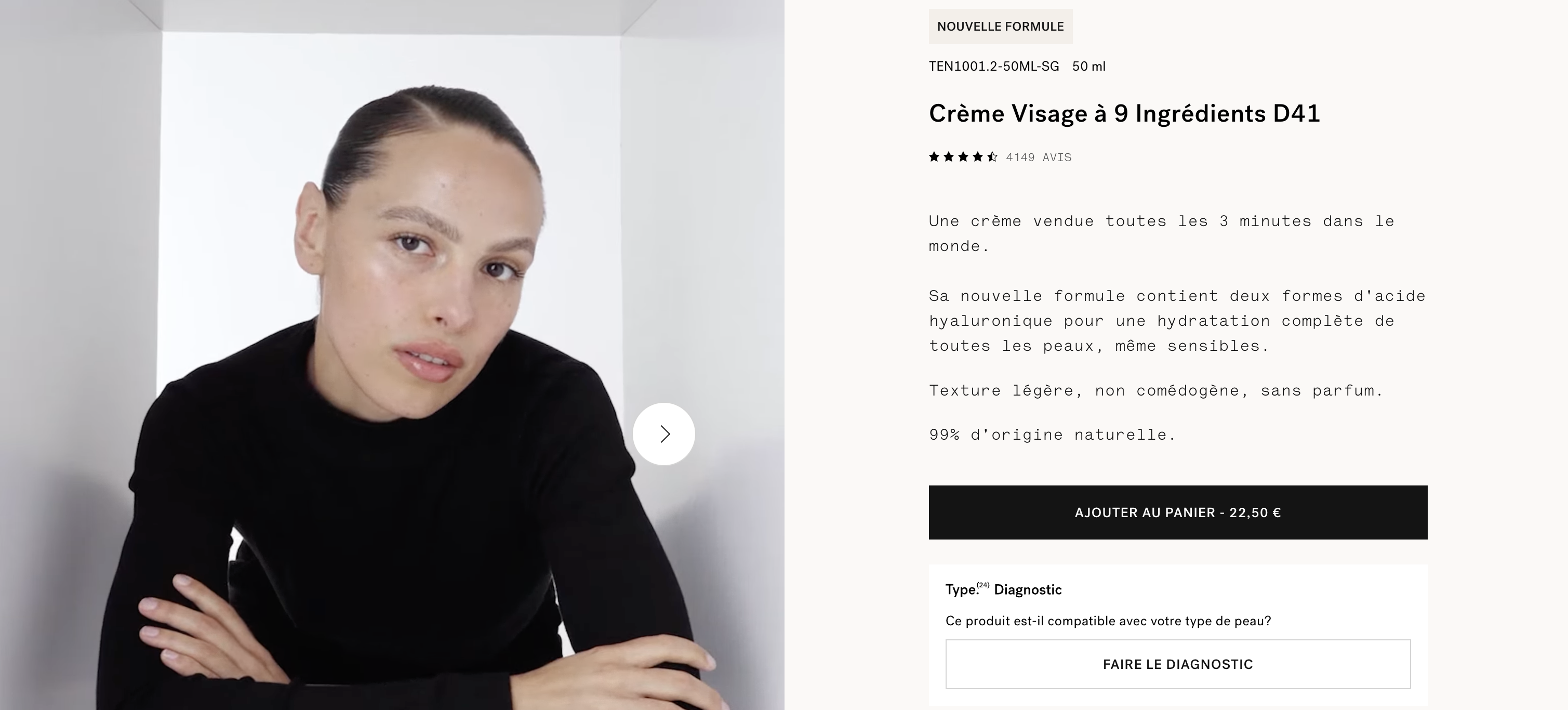
A micro diagnostic module built directly into product pages. Underrated in practice, this format targets the visitors closest to a purchase decision — the ones who have already navigated to a specific product and are hesitating.
Visitors who have scrolled as far as the buy button are in decision mode. A diagnostic micro-CTA at that spot helps them make the call without leaving the page — which is fundamentally different from a diagnostic started out of curiosity from the homepage.
4.Sticky bar
The sticky bar stays visible throughout the whole session, however far the visitor scrolls. It's a passive reminder format, not an active conversion format. Its real job is to keep the diagnostic in the visitor's field of awareness during a long session — not to trigger an immediate click.



- Maximum height: 52px. Beyond that, the sticky bar overlaps the browser's native controls (the Chrome bar, Safari's back button) — and the visitor starts looking for a way to close it, not to click it.
- Close button: mandatory. A sticky bar with no way out reads as intrusive, especially on mobile. Always offer a visible close icon.
- Appearance delay: don't show it right away. Wait until the visitor is engaged (8 to 15 seconds of browsing, or after a certain amount of scroll) so you don't create a sense of visual overload on arrival.
- z-index conflicts: check that the sticky bar isn't covering cookie pop-ups, confirmation modals or support chat widgets.
5.Pop-up
The pop-up is the most controversial format in digital marketing. Timed well, it catches visitors who would have left without acting. Timed badly, it degrades the experience enough to push up your bounce rate and hurt the quality of your paid traffic.
The trigger matters more than the content of the pop-up. A pop-up that fires immediately (<5 seconds) interrupts a visitor who hasn't yet had time to work out where they are. That same pop-up fired after 45 seconds or on exit intent is speaking to a visitor who has had time to engage — the reception is fundamentally different.
Trigger hierarchy
| Trigger | UX risk | Conditions for effectiveness |
|---|---|---|
| 2nd visit without a purchase | Very low | A known, unconverted visitor — the most receptive, since they already know the brand |
| Exit intent | Low | Desktop only (mobile exit intent isn't technically reliable) |
| 60%+ scroll on a product page | Low | A visitor in deep exploration mode, receptive to guidance |
| Delay > 45 seconds | Moderate | Show it once per session, and exclude existing customers |
| Immediate (< 5 seconds) | Very high | Avoid — it interrupts before any engagement and hurts your quality score |
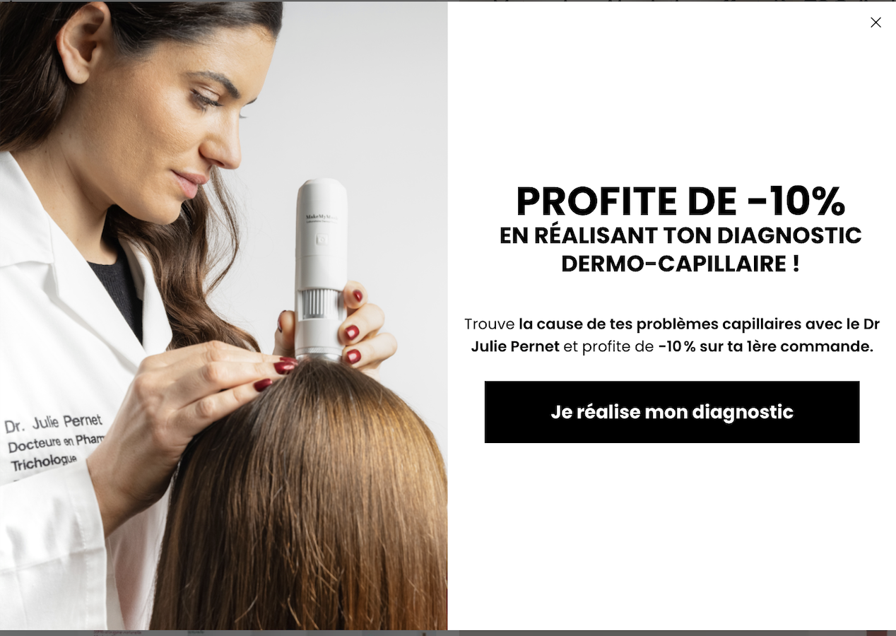
Anatomy of an effective diagnostic pop-up (recommended structure)
Visual: a skincare illustration, not a product photo (avoid the salesy look)
Headline: a question or a concrete problem (“Torn between two products?”)
Value in one sentence: “Our diagnostic points you to your exact routine.”
Reassurance: “Free · 2 min · No sign-up”
Primary CTA: solid button: “Take the diagnostic”
Dismiss link: plain text, “No thanks” — not just an X
Gamification: the wheel, the scratch card, the surprise
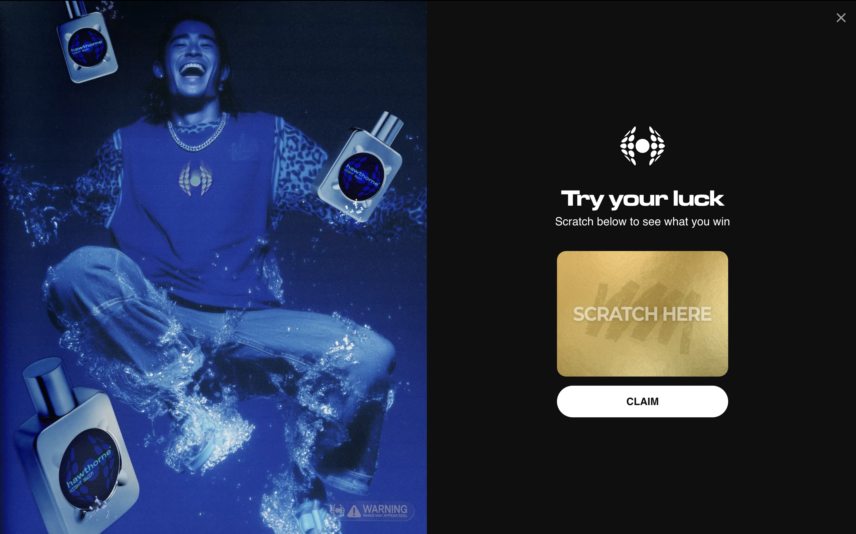
This is a mechanic used more and more to lift the diagnostic start rate. The principle: instead of showing a “Take the diagnostic” CTA straight away, you offer a game first — a scratch card, a wheel of fortune, an “open your surprise” — and what the visitor wins is an offer tied to the diagnostic results (a free product, a discount on the recommended routine, a personalized sample). The effect is twofold: the game creates emotional engagement before the first click even happens, and the prize gives an extra reason to finish the diagnostic in order to claim it.
6.Dedicated page (for paid media)
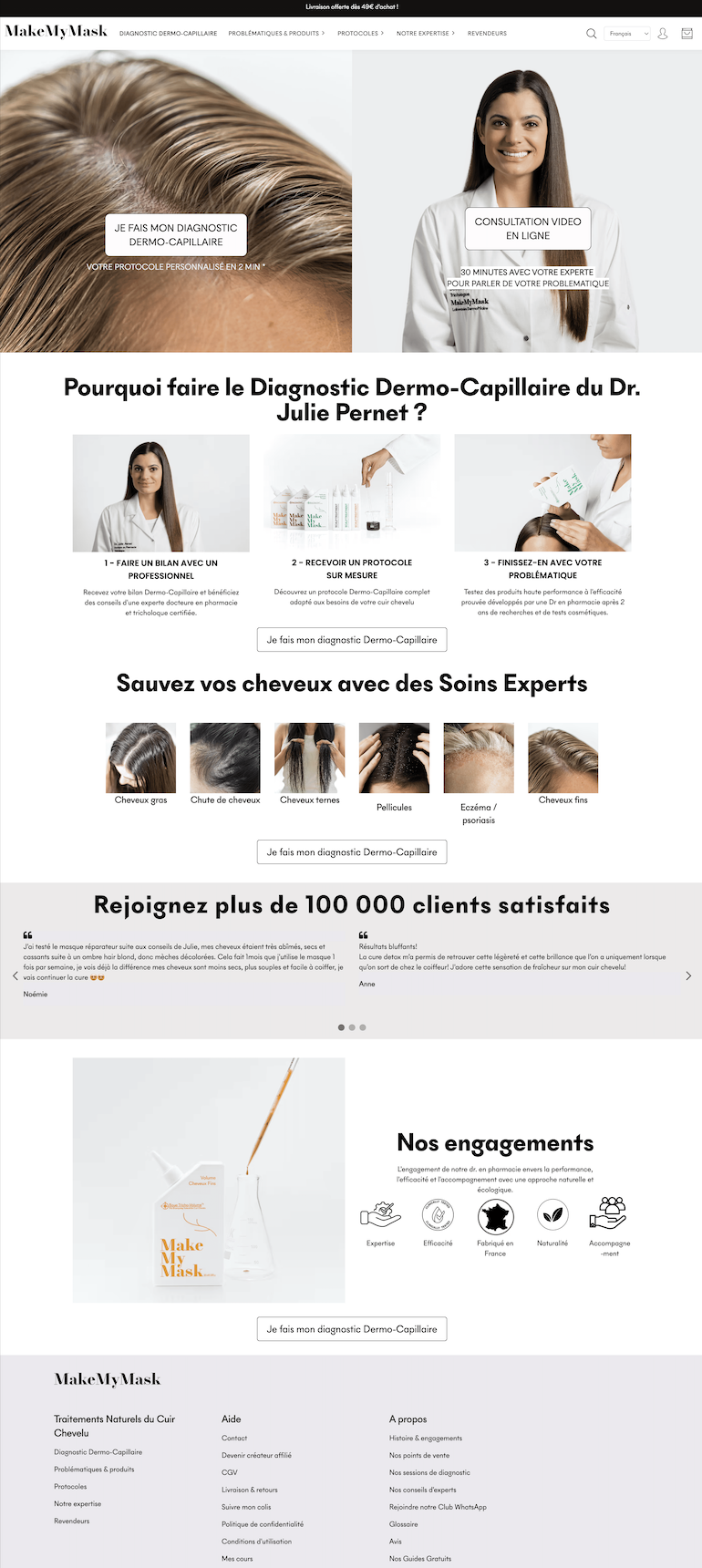
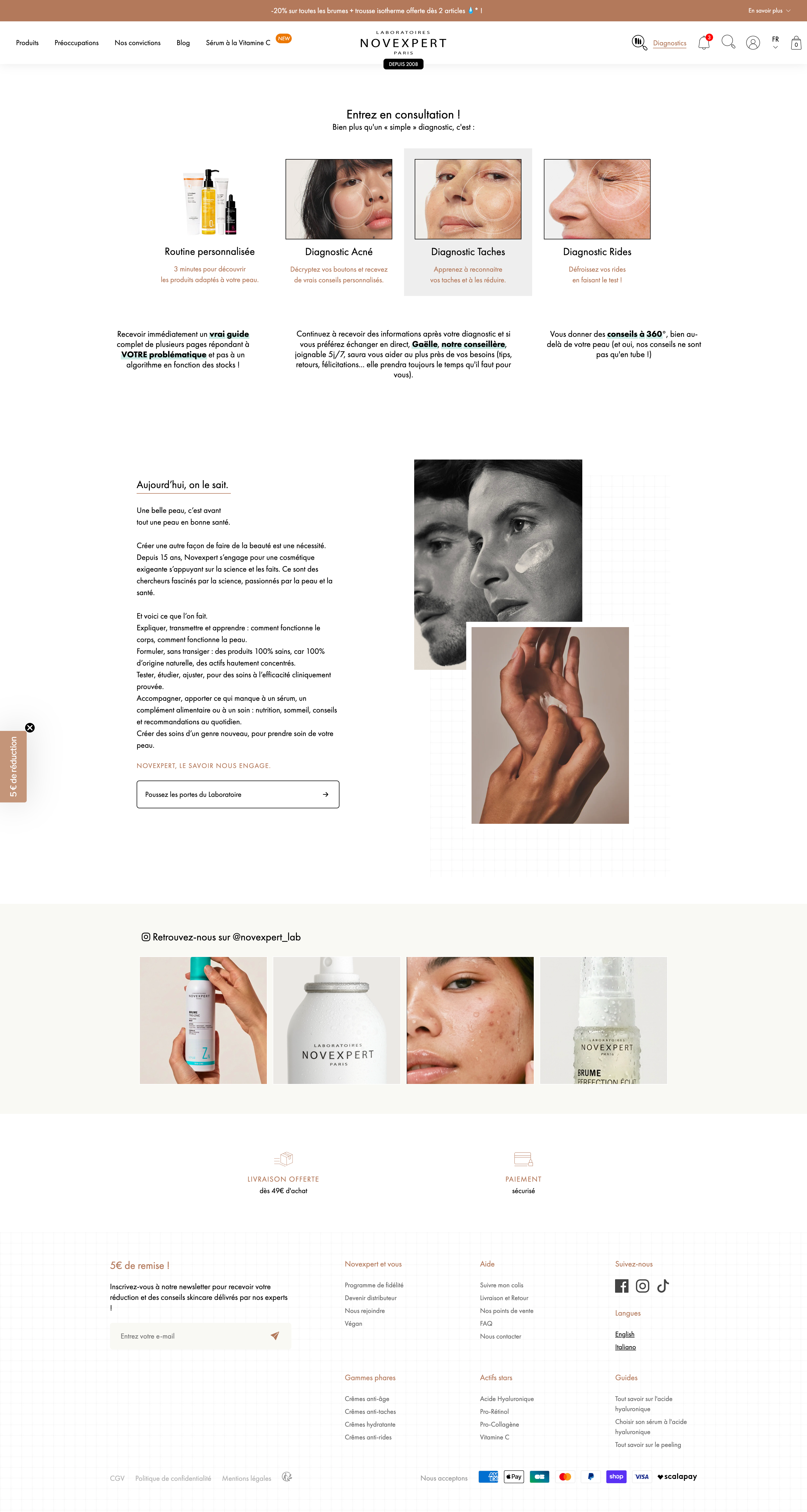
The dedicated page is the most complete and most strategic integration for paid traffic. It creates an immersive, controlled context where the visitor immediately understands the proposition, with nothing competing for attention: no full product menu, no side promotions, no support chat.
For Meta Ads and Google Ads campaigns, sending traffic to a homepage with a full menu and competing elements multiplies the possible exit points. A dedicated page with no side navigation cuts those exits and mechanically improves the ratio between ad clicks and diagnostic sessions actually started. It's also a positive signal for the ad algorithms , which assess how well the ad and the landing page line up.
Recommended architecture
Section 1, Hero: strong headline + benefit subhead + a CTA visible without scrolling.
Section 2, How it works: 3 illustrated steps (“Answer the questions → Analysis → Routine”)
Section 3, Reassurance: concrete testimonials, a rating, the number of diagnostics completed
Section 4, Repeated CTA: repeat the button at the bottom of the page, for the visitors who scroll.

Recommended URLs:
yourbrand.com/diagnostic (memorable, SEO-friendly)
7.Floating widget
A fixed button at the bottom of the page, persistent throughout the session. Less intrusive than a full-width sticky bar, it stays available without imposing a heavy visual presence. Its job is to give access to the diagnostic at any moment — not to actively push people to start it.
There's a well-documented UX paradox with floating buttons: the more visible they are (large format, bright color, pulsing animation), the more intrusive they feel and the less they're clicked on purpose. Understated formats generate fewer accidental clicks but more qualified engagement — the visitor who clicks genuinely intends to start.
- Size: 48-56px across on desktop, 44px minimum on mobile (the touch target size recommended by Apple's and Google's guidelines).
- Hover label: “Find my routine” or “Skin diagnostic” — short and benefit-led.
- Delayed appearance: 10 to 15 seconds after landing on the site — not immediately.
- Positioning: bottom-left if a support chat already sits bottom-right. Two stacked buttons in the bottom-right corner create confusion.
- Icon: a magnifier, a leaf, a star or a skincare pictogram — avoid the chat bubble icon, which gets mistaken for customer support.